Concept · Shops & studios
Florist United Kingdom
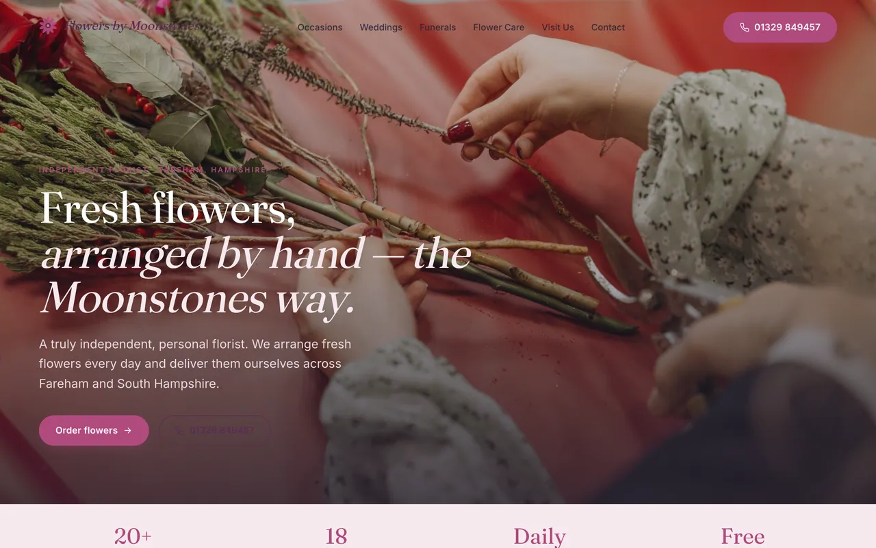
A calm, image-led florist site that lets the flowers lead, states the delivery area plainly, and keeps the phone one tap away.

What the concept does
The redesign, in a few ideas.
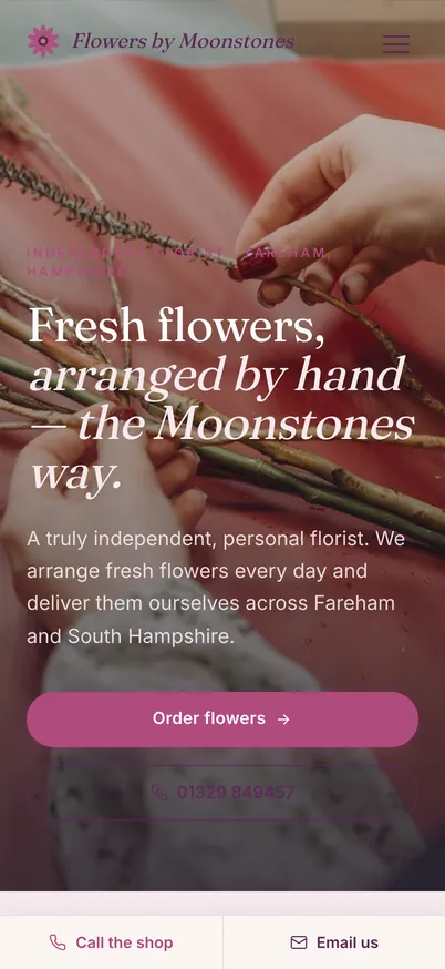
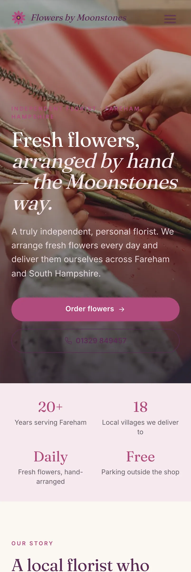
Call or book, always in reach
On phones, a button to call or book stays at the bottom of the screen while visitors scroll.
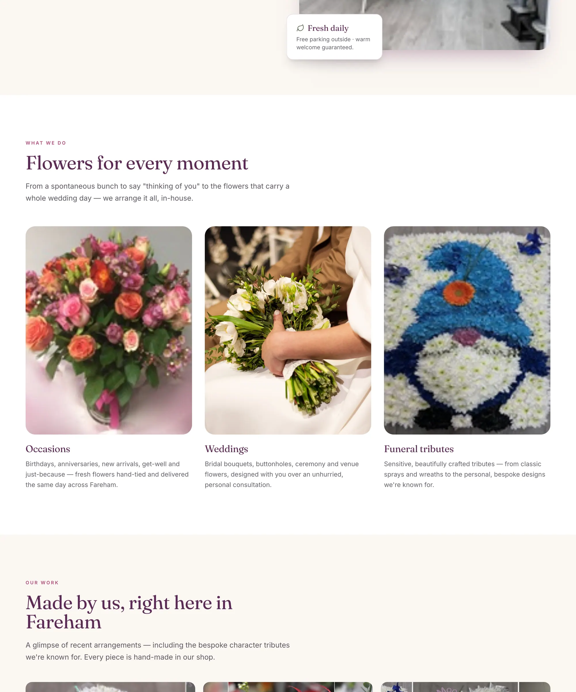
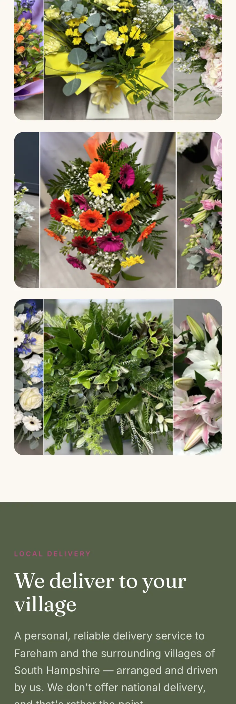
Photography given room
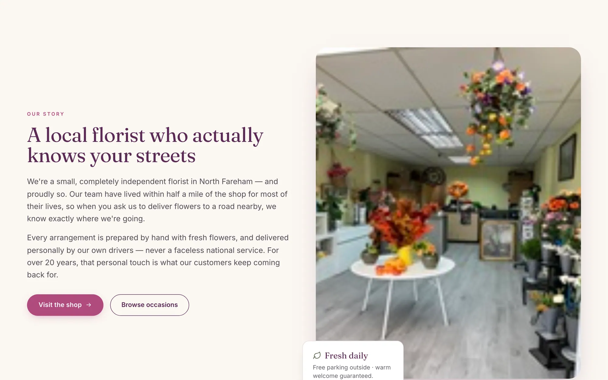
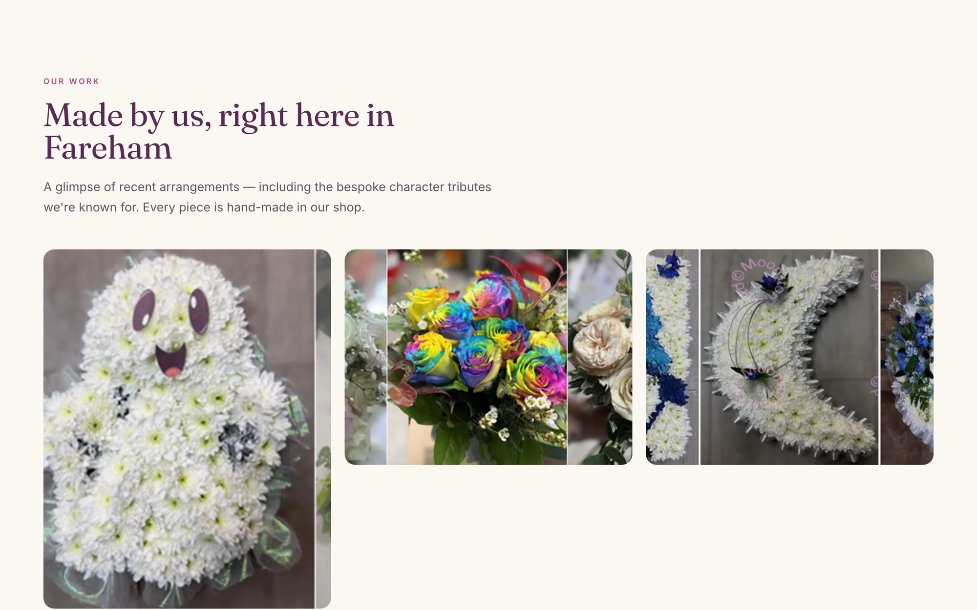
Their own photos are shown large, instead of squeezed into small thumbnails.
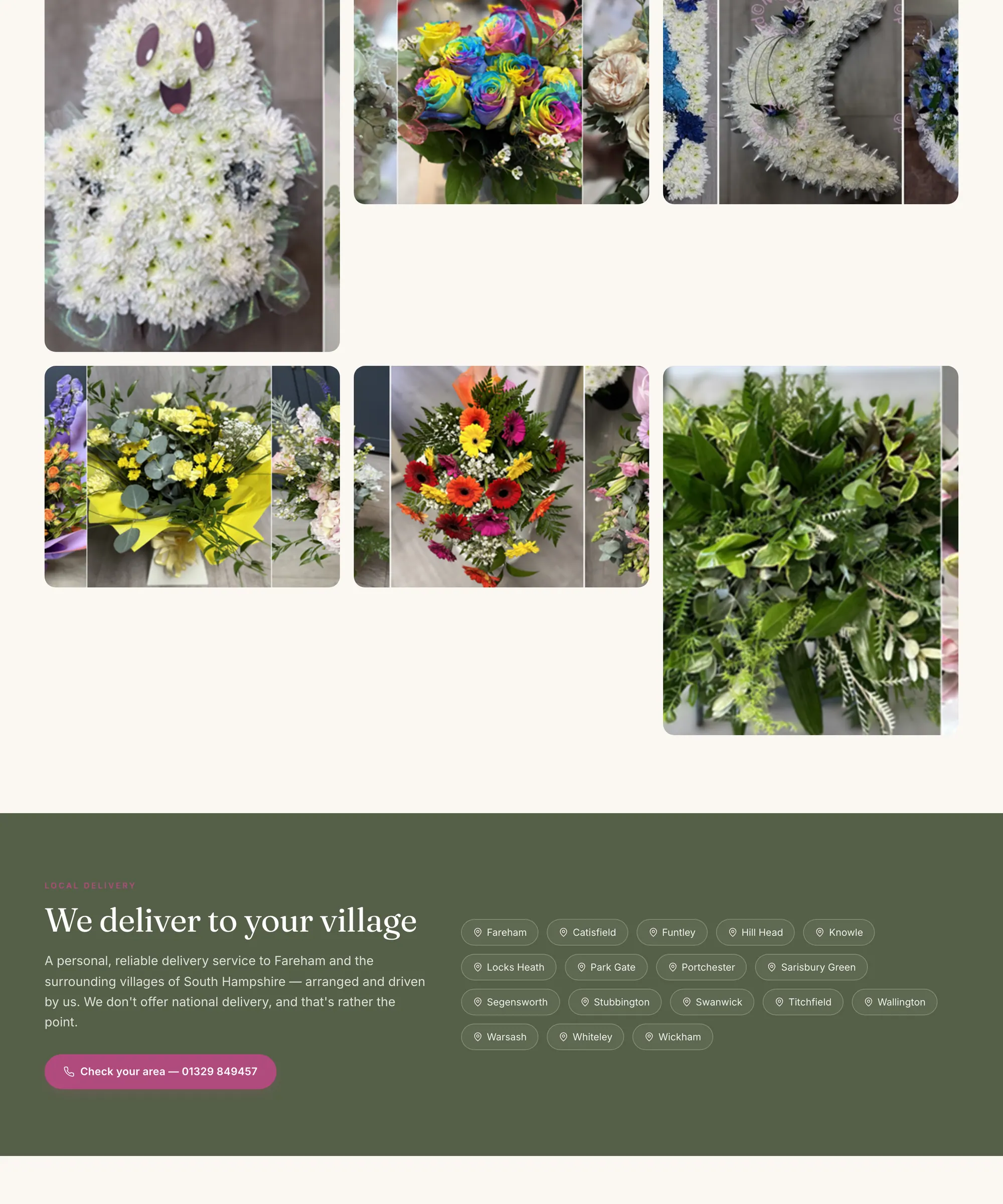
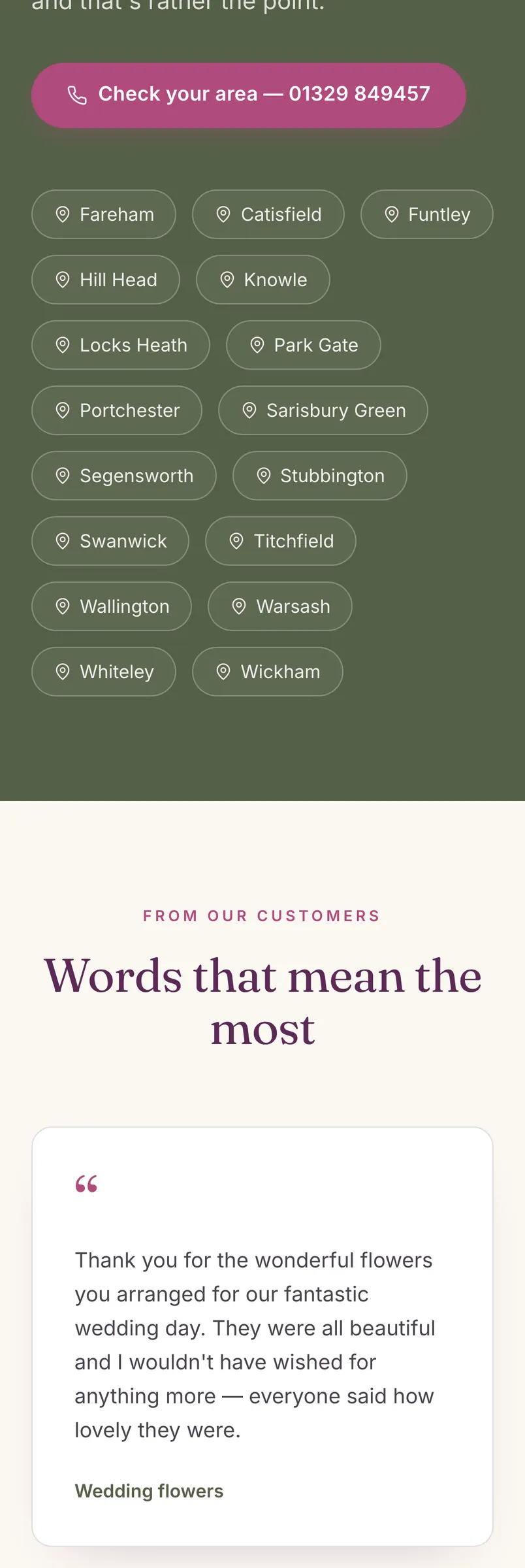
Where they work
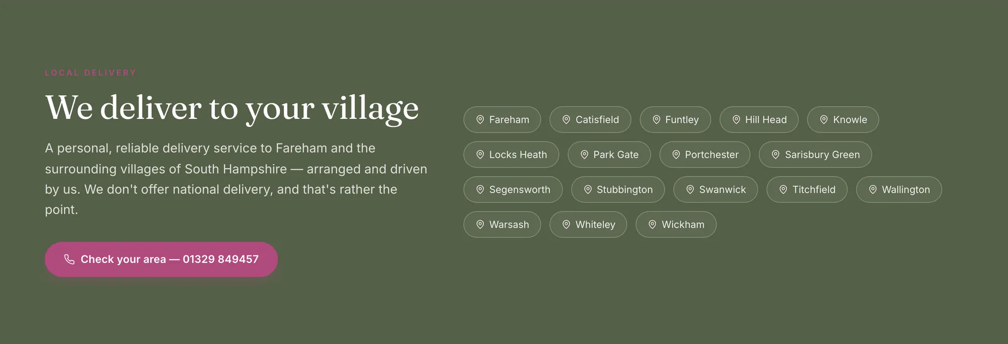
The area they cover is stated plainly, so people can tell straight away whether they’re in reach.
Credentials up front
Registrations, accreditations and trusted partners are shown near the top, not buried in the footer.
Products you can browse
The range is organised into categories and cards, so people can explore it instead of reading a list.
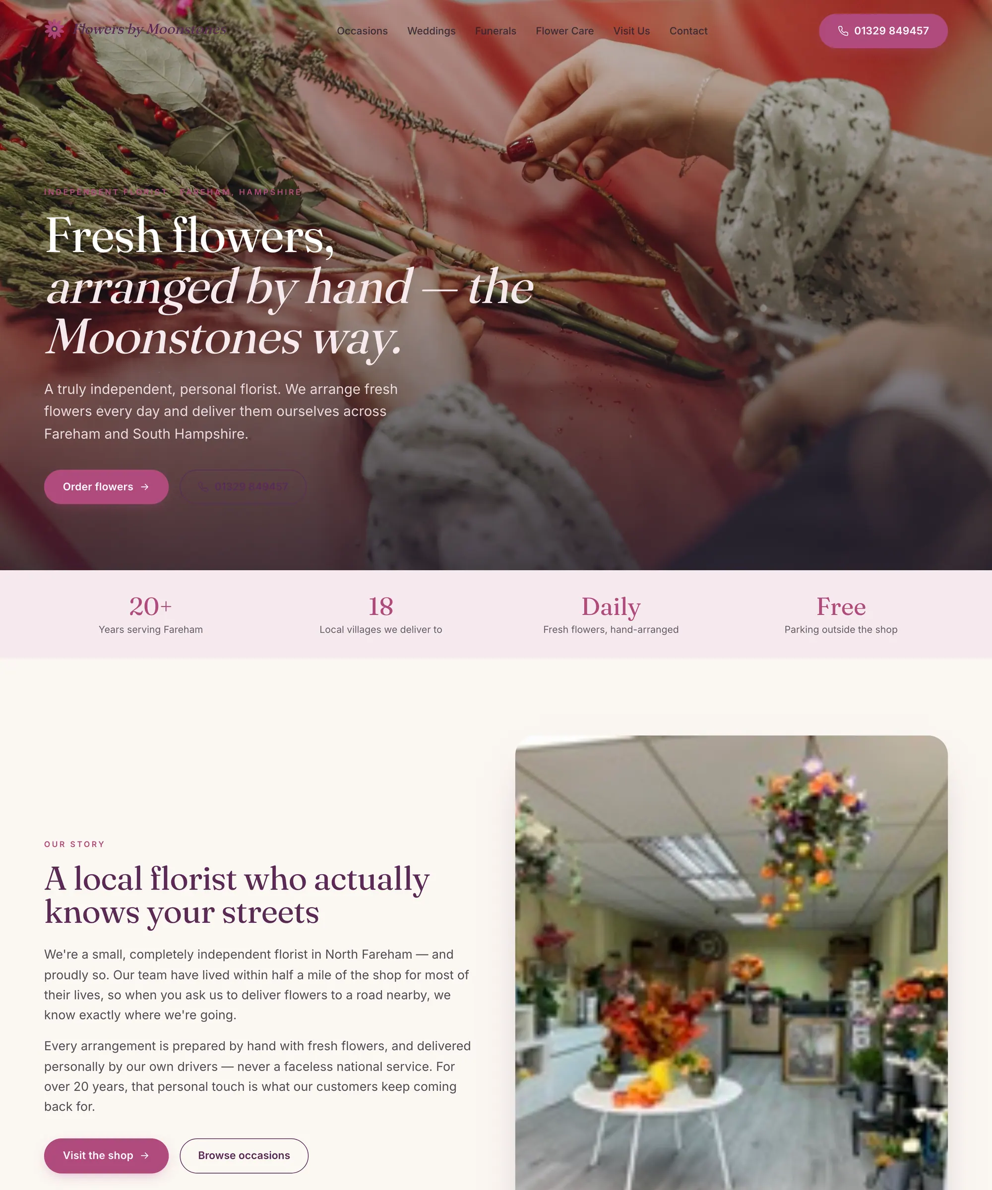
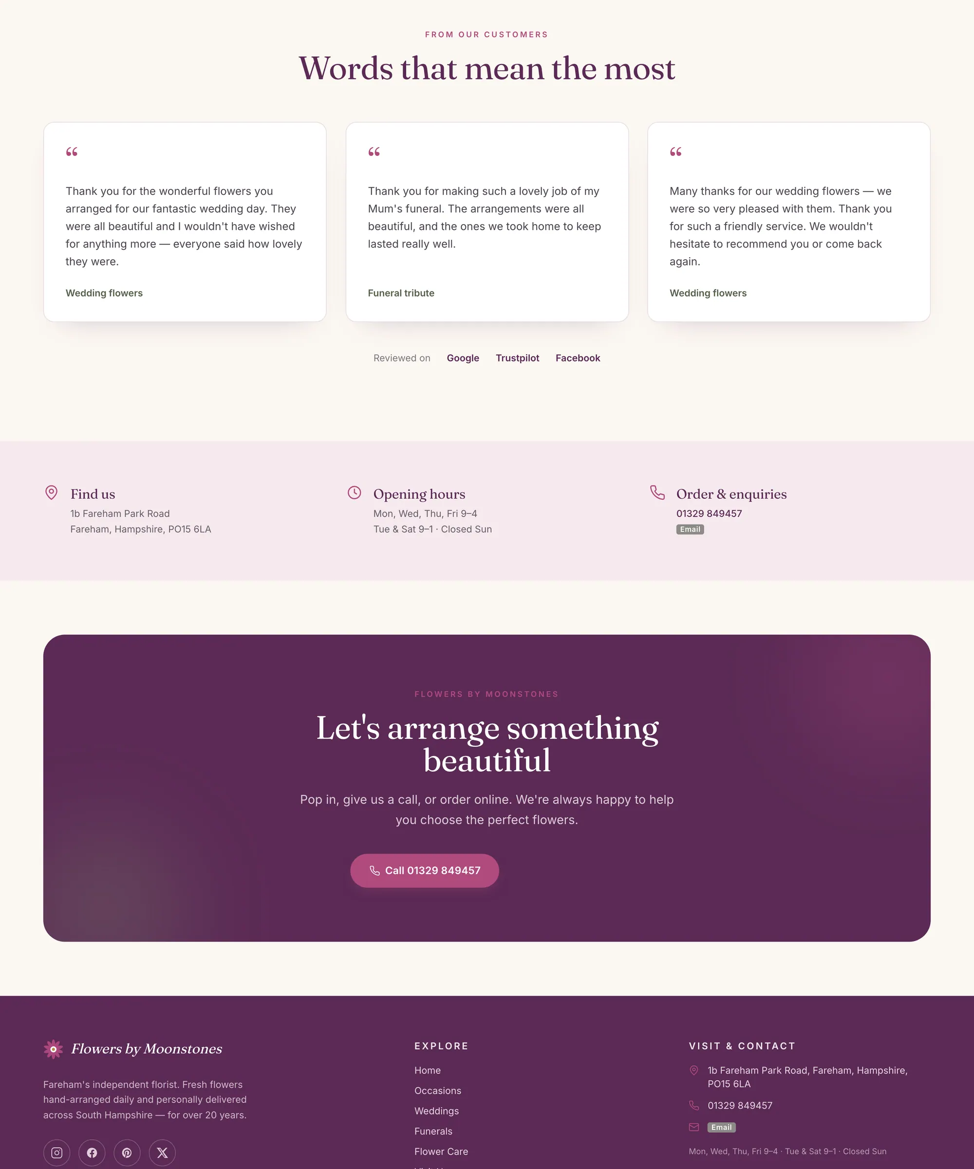
The whole page
Scroll it top to bottom.

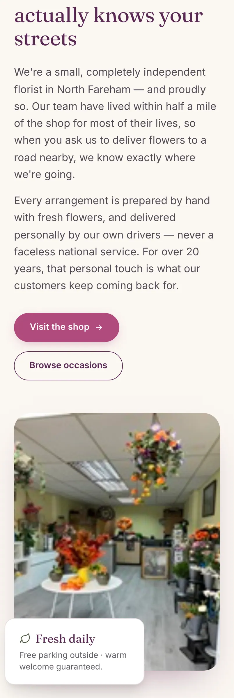
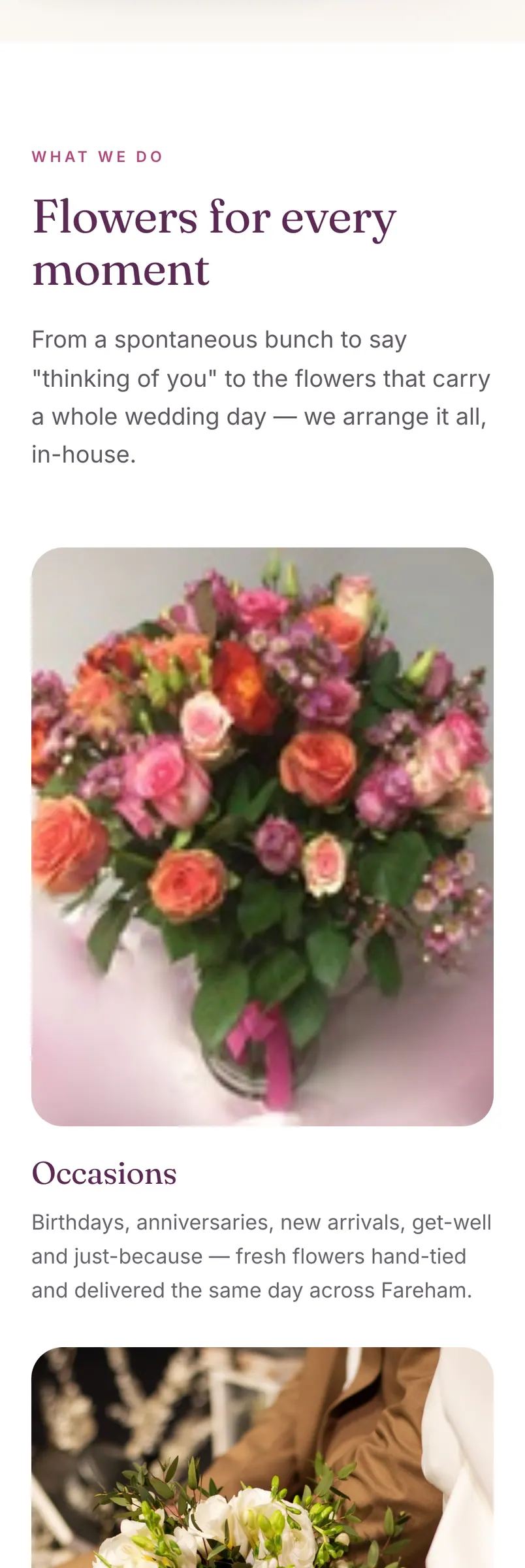
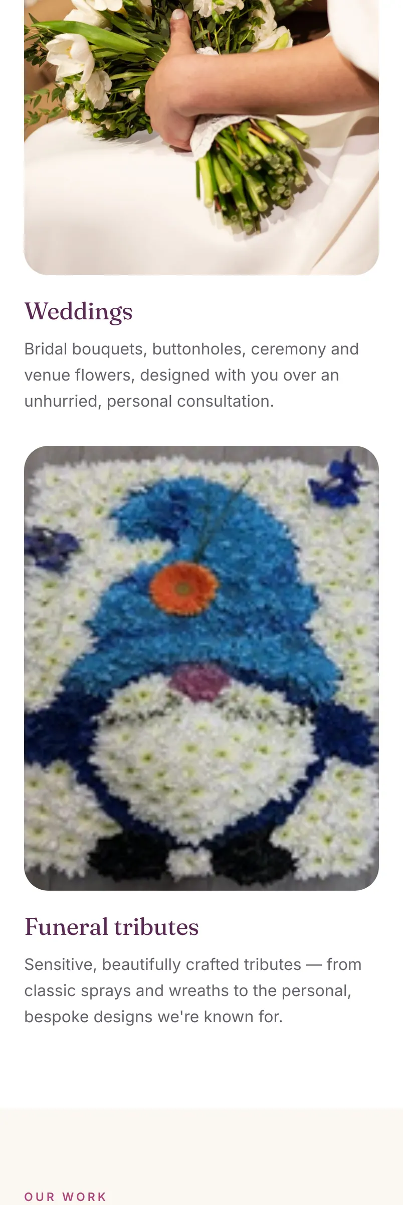
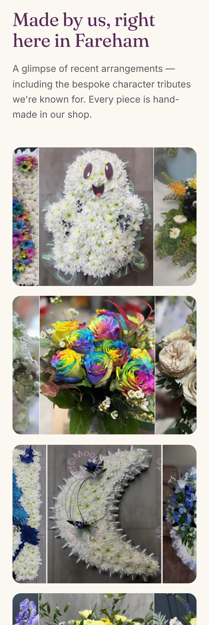
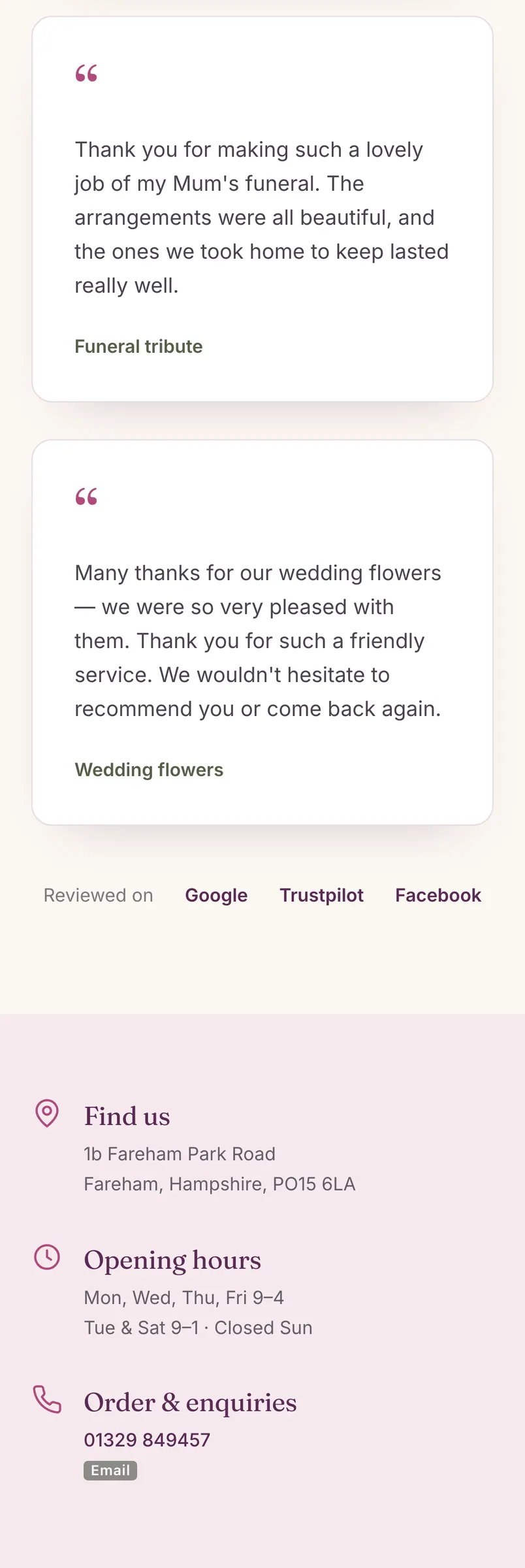
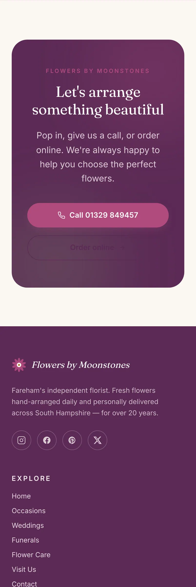
Up close
The details that do the work.
Unsolicited concept, shown as built. Not affiliated with or endorsed by the business.
Got a preview from me?
Tell me what you think — even if it’s no.
The quickest way is a reply to my LinkedIn message.